Swatch has always treated the watch as a small, wearable canvas, but its Destination Art collection takes that idea somewhere more specific and more personal. Instead of designing centrally in Switzerland and shipping the same watch everywhere, Swatch invites a local artist in each city to design a piece that belongs to that city alone, sold only in the boutiques of the place it depicts, wrapped in packaging the artist designed too. The result is less a watch collection than a small, scattered museum: a version of Amsterdam that only exists in Amsterdam, a version of Melbourne that only exists in Melbourne, each one a real artist's genuine way of seeing the place they call home, compressed onto a forty one millimeter dial and a printed strap. Six of these pieces make up the collection as it stands today, from a Dutch based illustrator's fable about the sun to a Peek Whurrong woman's tribute to her own sister, and each one rewards a much closer look than a souvenir usually gets.
Amsterdam: A Promise of Sun
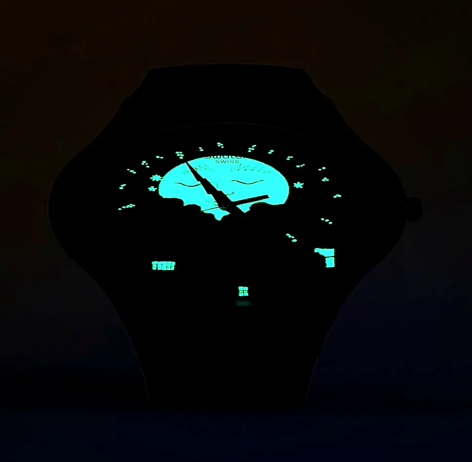
Of the whole collection, the Amsterdam watch is the one that most feels like it was written before it was drawn. It is called A Promise of Sun, and it comes from Enzo Pérès-Labourdette, a French illustrator born in 1991 in Le Puy-en-Velay who has lived and worked in Amsterdam long enough to be trusted with the city's own image; in 2023 he had already painted two enormous murals, each two meters by five, of fantastical Amsterdam canal houses for the walls of Swatch's own P.C. Hooftstraat store, so this watch is really a continuation of a relationship rather than a first commission. His design wraps the dial and the packaging in a poetic, hand drawn version of the city: the stepped gables of canal houses, a sky that visibly shifts and churns, and at the center of it all, a sun with a face, rendered the way a child's drawing renders the sun, present on almost every watch in this collection's visual language but nowhere else quite this literal. Enzo has described that sun himself as a lucky charm to keep your wrist company by day that quietly transforms into a mysterious moon at night, and that transformation is not a figure of speech, it is Luminova, the phosphorescent material used across fine watchmaking for glowing hands and markers, worked here into the sun's rays and into a scattering of the canal house windows, so that after dark the cheerful daytime illustration gives way to a second, secret nighttime version of the same skyline, its windows lit as if someone were still awake inside. A small calendar wheel at six o'clock carries the joke even further, cycling every day between rain, a rainbow, and a shooting star, which is less a design flourish than an accurate weather forecast for a city where all three genuinely can happen before lunch. The watch itself is cased in a matte, transparent blue biosourced plastic, 41 millimeters across, with a printed strap that continues the illustration all the way around the wrist, and it was designed, deliberately, as a good luck charm for cyclists first and everyone else second, which feels exactly right for a city built as much for bicycles as for canals.



format_quote"A lucky sun to keep your wrist company by day, that transforms into a mysterious moon at night."
Enzo Pérès-Labourdette
Barcelona: Grancelona
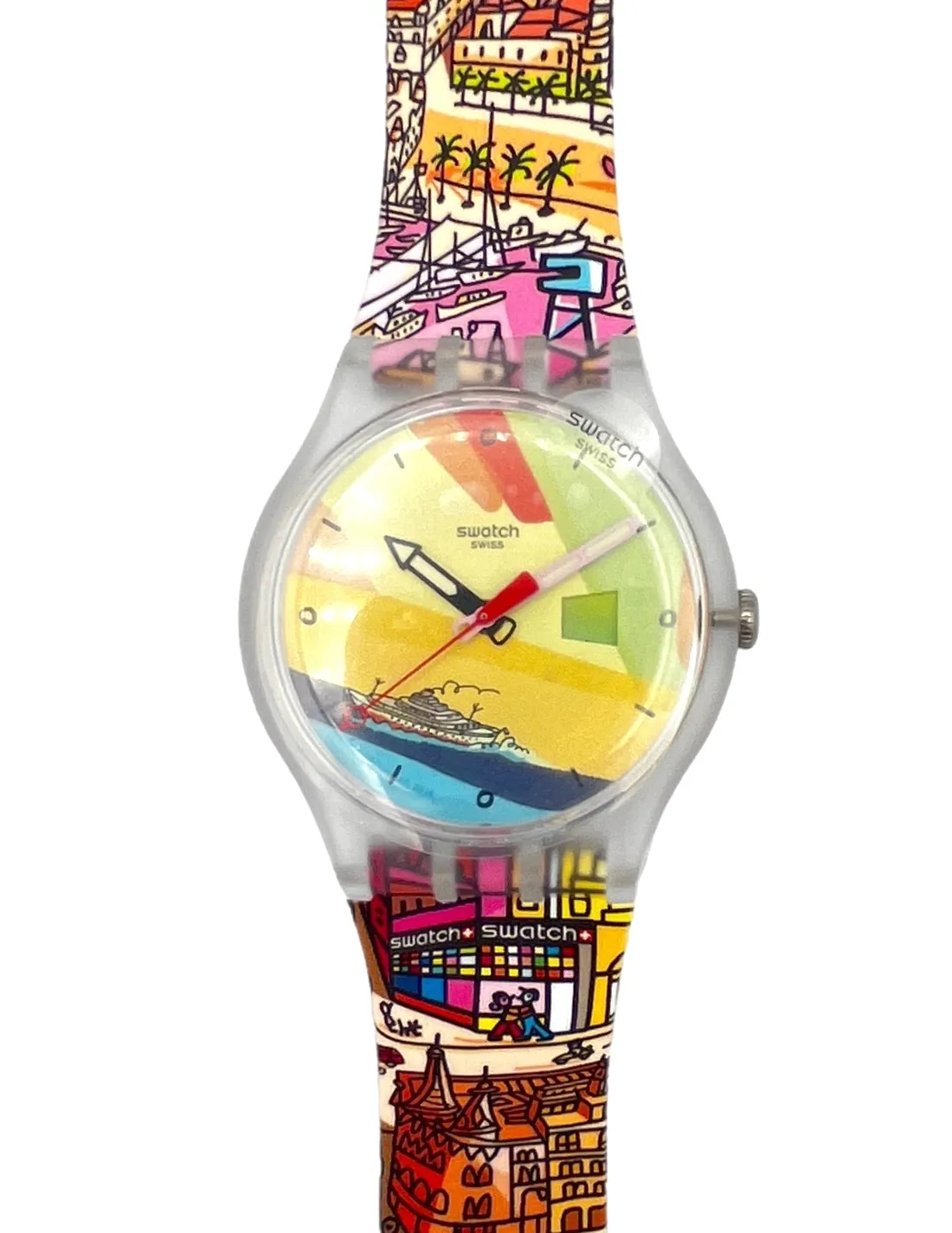
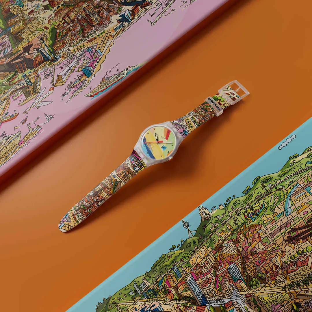
Where Amsterdam tells one continuous, personal story, Barcelona's entry takes the opposite approach and tries to fit the entire city onto a wrist at once. Grancelona comes from Javier Mariscal, a Valencia born, Barcelona based designer whose career has been defined, in his own words, by a single idea: freedom. Mariscal is best known outside the design world for Cobi, the deliberately odd, cubist mascot he created for the 1992 Barcelona Olympics, a piece of design so strange it was controversial when it launched and beloved by the time the games ended, which tells you most of what you need to know about how he approaches a commission. For Grancelona he painted an original mural at Swatch's Passeig de Gràcia store that places the shop itself at the center of a map of the city containing more than sixty landmarks, from Gaudí's Casa Batlló to the Fabra Observatory to the Arc de Triomf, rendered in the loose, joyfully overcrowded linework that has always been his signature. That same map wraps the watch's strap, while the multicolored dial carries its own small piece of kinetic mischief, a calendar wheel that quietly shifts its colors and hand drawn figures across a fourteen day cycle, so the watch never looks quite the same on any two visits to the same street. A black glow in the dark hour hand and a pink glow in the dark minute hand keep time after dark, with a red seconds hand sweeping beneath them, the whole assembly housed in a matte transparent biosourced case that lets the color underneath do all the talking.
Madrid: Chulapo
Madrid's watch takes a third approach entirely, skipping landmarks and postcard imagery altogether in favor of something more local and considerably more mischievous. Chulapo is the work of Gonzalo Hernández Sánchez de Ocaña, a Madrid based multidisciplinary artist who works under the name Gonhdo and cites an unusually specific set of influences: Keith Haring's pop art and street culture, Piet Mondrian's neoplasticism, and Diego Rivera's murals, three very different twentieth century visual languages folded into one. Rather than draw the Royal Palace or the Prado, Gonhdo went after Madrid's own idea of itself, what locals call castizo, the city's most traditionally, stubbornly Madrileño self image, centered on the chulapos and chulapas, the elaborately dressed traditional figures who parade through the streets every May for the festival of San Isidro, the city's patron saint. Bold black outlines carry checkered caps, carnations, and the ingredients of cocido madrileño, the chickpea and meat stew that is arguably Madrid's most beloved dish, scattered across a plain white background in blocks of primary and secondary color, with a matching cast of characters continuing across the printed strap. It is, in effect, a watch about the parts of Madrid that guidebooks rarely explain properly, worn as a small badge of local knowledge.


Hawaii: Hawai'i Nei
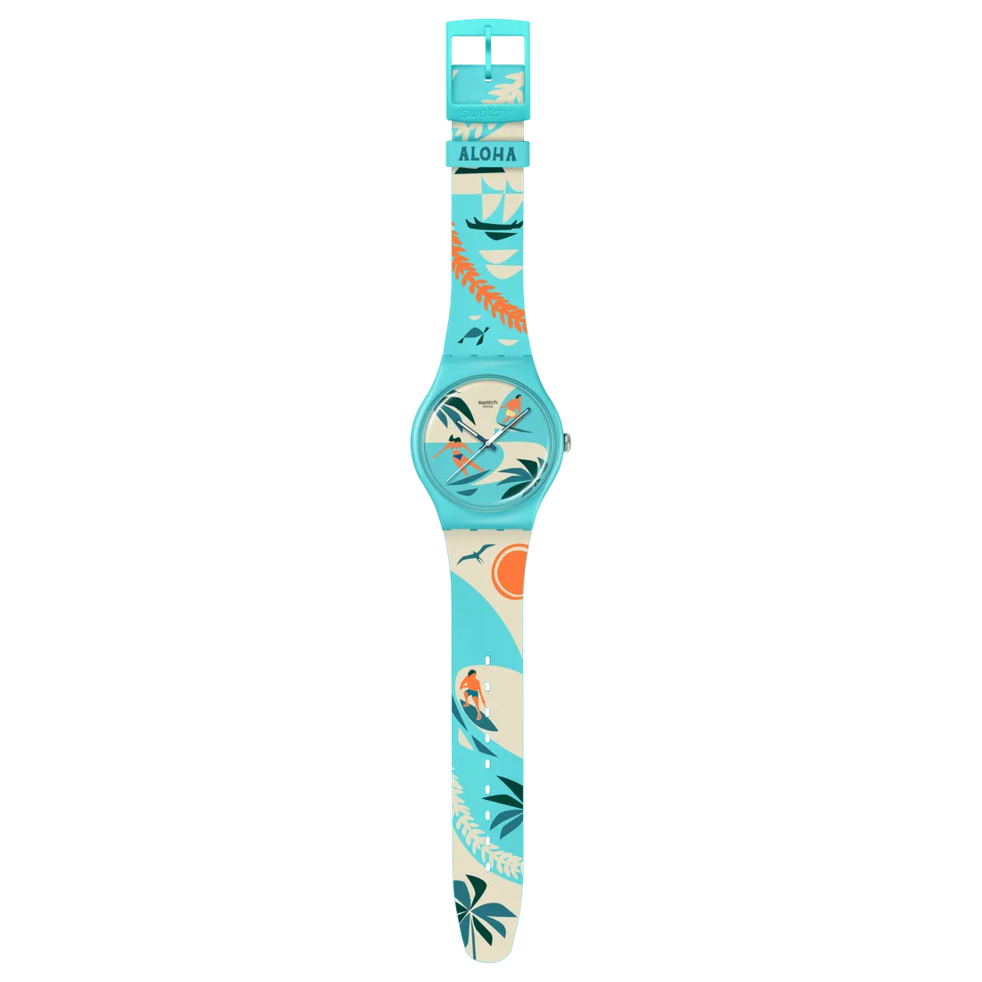
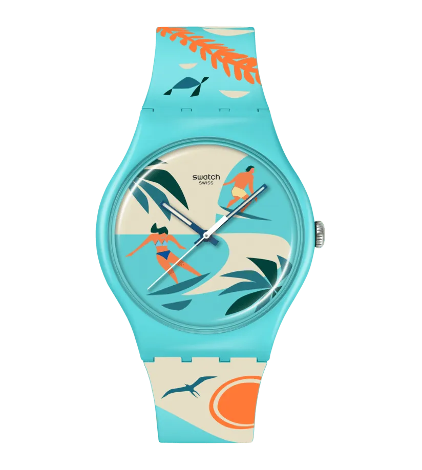
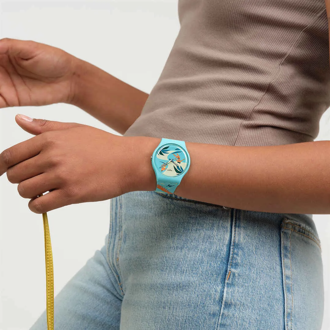
The Hawaii watch turns toward landscape and light rather than folklore, in the hands of Nick Kuchar, an Oʻahu based artist whose vintage inspired surf and travel illustrations have decorated everything from surfboards to postcards across the islands for years, built from a blend of sketching, photography, acrylic paint, and digital illustration. The watch's name, Hawai'i Nei, uses a small but important Hawaiian word: nei roughly means 'this here' or 'beloved,' turning a simple place name into something closer to 'our own beloved Hawaii,' the phrase locals use rather than the one tourists learn. Kuchar's illustration wraps the watch and its packaging in a sun bleached palette of turquoise and cream, tracing the North Shore's famous waves, outrigger canoes under sail, palm trees, reef fish, and the 'iwa, the great frigatebird whose silhouette is one of the most recognizable in Hawaiian iconography. A small mechanical joke lives in the calendar wheel here too: each day it quietly changes the color of the swimsuit worn by the tiny surfer illustrated on the dial, a detail easy to miss and delightful to notice, closed with a matte turquoise buckle that matches the water it is drawn from.
California: One California
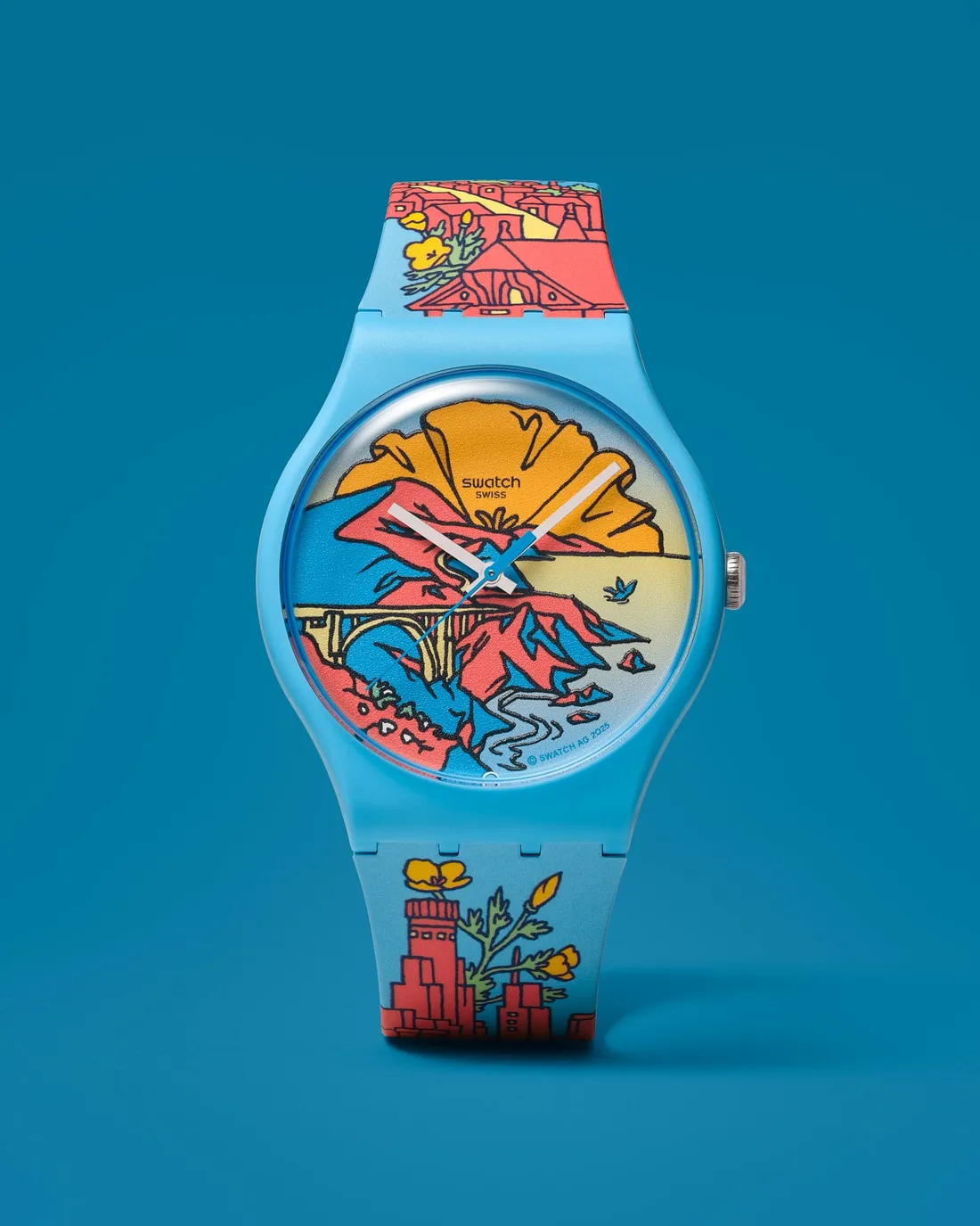
California's watch, One California, is effectively a road trip compressed onto a wrist, drawn by Amos Goldbaum, an artist whose intricate line work is known for folding multiple places, times, and perspectives into a single continuous image rather than choosing just one view. Read the watch band from top to bottom and you are tracing the length of the state: the upper half carries San Francisco, the granite domes of Yosemite, and the oddly turreted Winchester Mystery House in San Jose, while the lower half runs through Los Angeles, the spiked silhouettes of Joshua Tree, and the lighthouse at Point Loma in San Diego. The dial itself is where north and south finally meet, joined by the Bixby Bridge at Big Sur, arguably California's most photographed piece of infrastructure, while a California poppy, the state's official flower, sets like a second sun over the ocean and the ribbon of Highway 1 winds its way through the whole scene. It is a watch that rewards being read slowly, the way you would read a map rather than glance at a dial.

Melbourne: Tirrike
The most quietly personal watch in the whole collection belongs to Melbourne, and it carries a weight the others do not attempt. Tirrike was designed by Bayley Mifsud, who also works under the name Merindah-Gunya, a proud Peek Whurrong woman of the Maar Nation from Warrnambool in south west Victoria, now based in Naarm, the name the Woiwurrung people of the Kulin Nation have always used for the place colonial mapmakers later called Melbourne. Mifsud is the first Aboriginal artist Swatch has ever worked with, and rather than illustrate skylines or landmarks, her design speaks in ancestral symbolism: the flowing lines of the Birrarung, the river the city was built alongside, traced alongside the tracks of emu and kangaroo, laid out in the warm reds, oranges, and blues of contemporary Aboriginal dot and line painting. The watch's name is the most personal detail of all. Tirrike, pronounced tira-key, is the Peek Whurrong name of Bayley's own younger sister Zali, and it means happiness and hope, so that everyone who buys this watch in Melbourne is, whether they know it or not, wearing one artist's private tribute to her own family on their wrist, a piece of storytelling considerably deeper than anything a landmark or a mascot could carry.
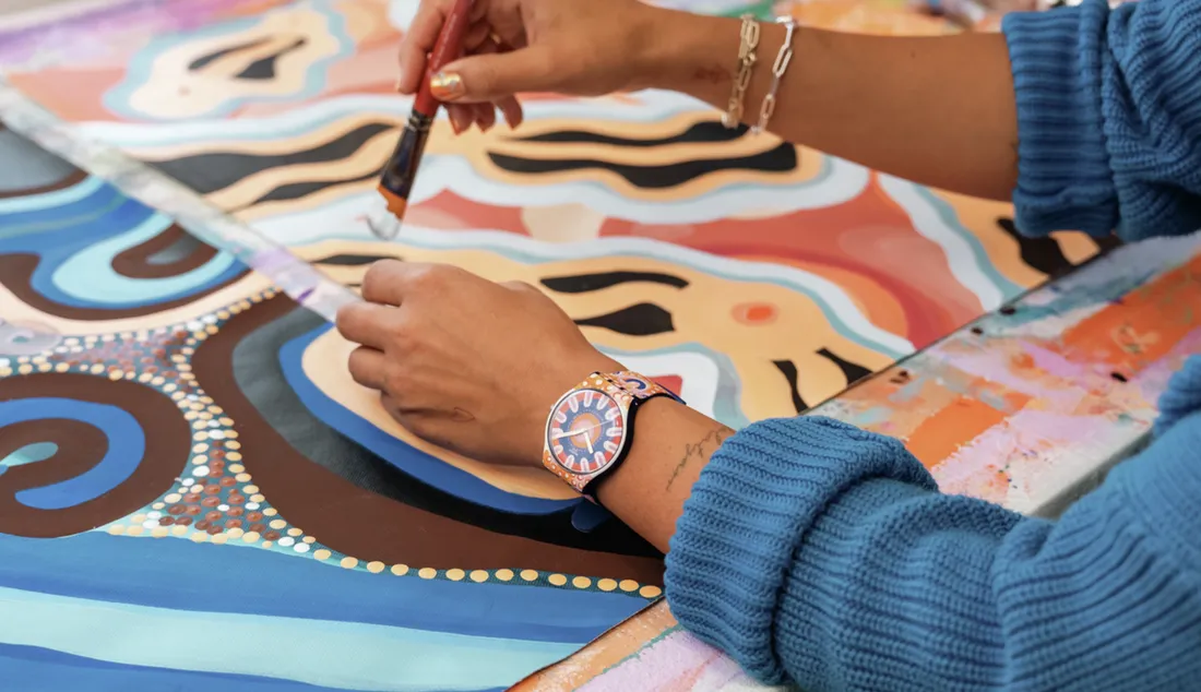

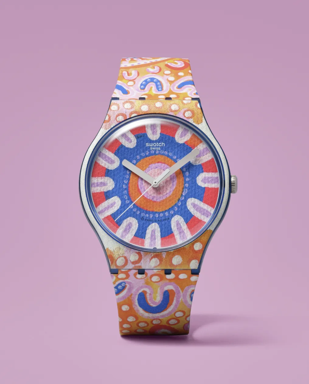
format_quote"Tirrike means happiness and hope, and it is also the name of the artist's own little sister."
Line all six up next to each other and what stands out is not a shared visual style, because there isn't one; Enzo's soft, hand drawn Amsterdam has almost nothing in common with Mariscal's crowded, cartoonish Barcelona map, and neither shares much with the quiet dot work of Bayley Mifsud's Melbourne. What connects them instead is the choice Swatch keeps making across every city: hand the pen to someone who actually lives there, let them draw the place as they actually see it rather than as a tourist board might sell it, and refuse to sell the result anywhere else. A cheap, cheerful, mass produced Swiss watch turns out to be an unusually honest way to ask an artist what their own city means to them, and in Amsterdam's glowing canal houses, Madrid's chulapos, and a Peek Whurrong woman's tribute to her sister, six very different answers show up on the wrist.