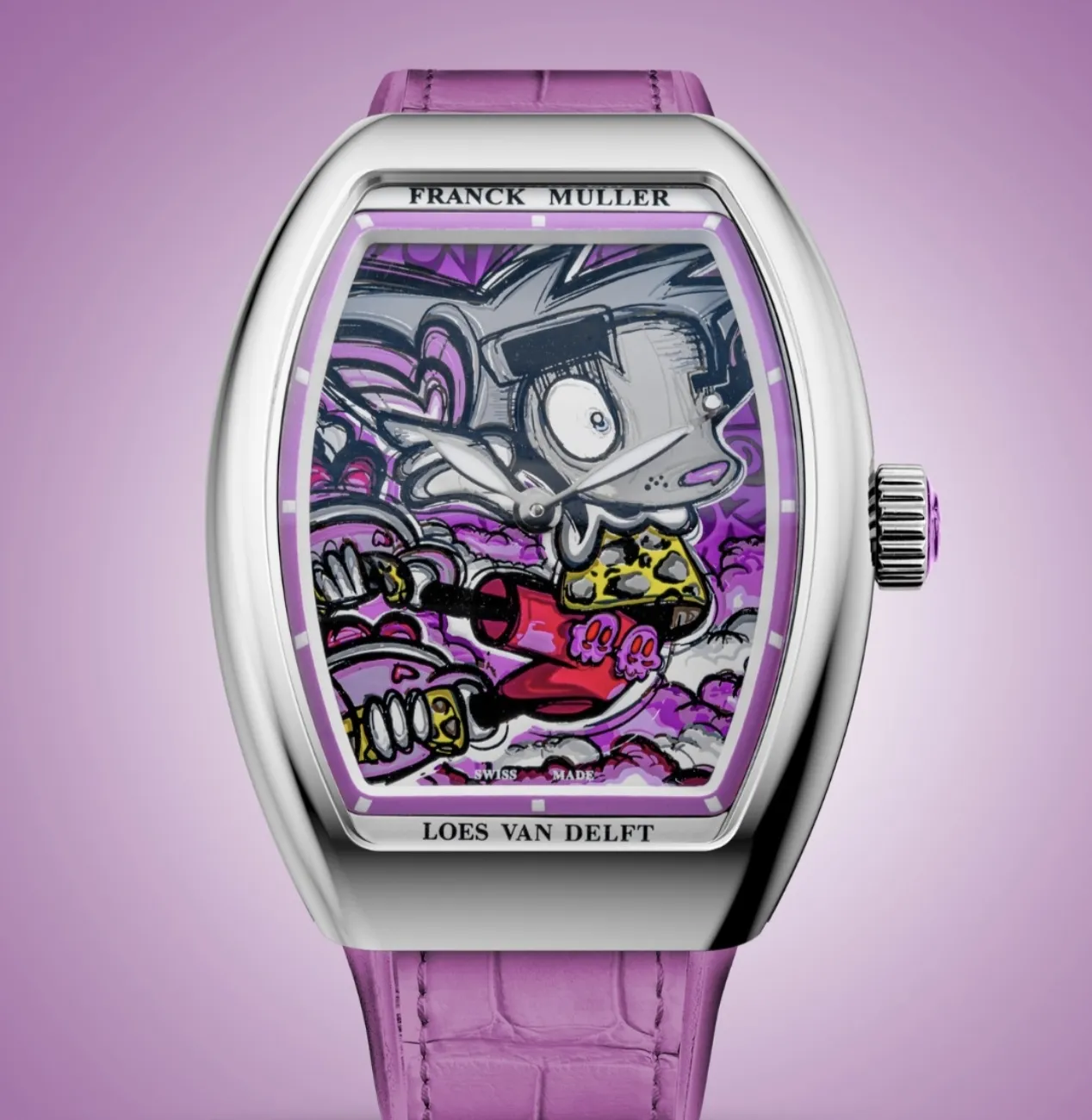
format_quote"While watchmakers in that quiet château on the lake shore at Genthod were setting wheels with tweezers under a microscope, the rattle of spray cans was echoing around a studio in Amsterdam. The Franck Muller Vanguard x Loes van Delft is not the collision of two separate universes; it is a neon pink stone thrown at the excessive seriousness of time."
Hasan Bekmezci
The Marble Temple of Geneva and the Smell of Acrylic in Amsterdam
Let us wind the clock back for a moment and look into two places at the same minute.
The Swiss watchmaking sanctuary known as Watchland sits inside a nineteenth-century estate at Genthod, on the northern shore of Lake Geneva. The movement workshop, the case workshop, the dial workshop and the strap workshop stand in separate buildings inside the same park. The men and women in white coats work in complete silence, in a sterile, almost sacred atmosphere where a single speck of dust can ruin a movement.
At exactly the same moment, in a damp industrial studio in Amsterdam that smells of paint, a young woman is pressing a spray can hard against a canvas. Inside an overall covered in paint marks, her eyes bright with intent, is Loes van Delft.
What separates these two rooms is not seriousness against playfulness but the cost of a mistake. At Genthod, if a craftsman’s hand slips by a hundredth of a millimetre the part goes in the bin. In Amsterdam, one extra press of the spray and the canvas simply acquires a new direction. One is a system built to eliminate error, the other a system built to use it. That the path of a house at the summit of traditional watchmaking should cross that of this wild painter is no accident; it is a rhythmic rebellion planned against time.
A Journey into the Designer’s Head: Why Does “Pjipje” Exist?
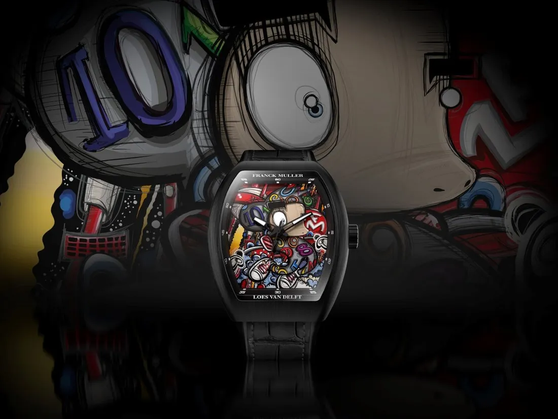
Step inside Loes van Delft’s mind and you meet a child in permanent revolt against the cold, rational, dreary world of adults. She began as a very young girl, scribbling in the margins of her notebooks, wanting to escape the artificial masks people wear and the obligation to “be mature” that society drops on your shoulders. It was out of that existential ache that “Pjipje” was born. That is how the name is spelled; English-speaking collectors have for years written it the easy way, as “Peejay”. By the artist’s own account the character was learned from nobody: it grew on its own, travelling from the margin of a notebook to canvas, from canvas to monumental sculpture, and from there to a Swiss dial.
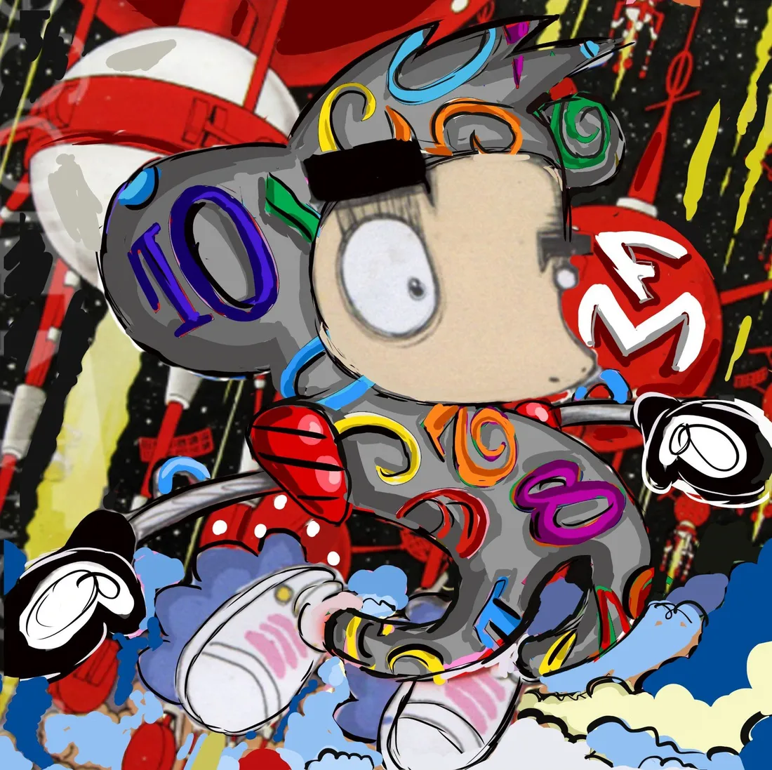
Pjipje, with his single startled enormous eye, his mischievously protruding round ears and the spray can in his hand, is half mouse and half imaginary creature. The Dutch press calls him a mouse-like figure, and the resemblance is a deliberate quotation: round ears, white gloves, one huge eye. More important still, he is the artist’s internal defence mechanism, armour against the chaos of the world and the tedious rules of adults. The thick black bar across his eyes is there for the same reason: the viewer sees, but the one being seen keeps himself hidden.
Her record is serious too. Born on 1 April 1991 in Drunen, trained at SintLucas, she took the Best Global Artist award at the Amsterdam International Art Fair in 2012, and in early 2021 the Deji Art Museum in Nanjing acquired every original work she had made in a single transaction. When Franck Muller knocked, it was not facing a social media phenomenon but a signature that had already entered a museum.
The Flâneur’s View and the Existential Fracture
A flâneur walking the streets of a city, however, reads this picture differently. Why should people, every time they glance at their wrists, have to meet those cold numerals that tell them only that their life is being subtracted, that they are ageing, that they are losing to time?
Time is not merely the mechanical, rational line counting downwards that the watchmakers of Geneva claim it to be. Why should there not stand behind that sapphire crystal a mad friend who prises you out of the artificial protocols of adulthood and the grey routine of life, and mocks the rules?
This has a technical counterpart. In classical high horology the centre of the dial is given to a tourbillon cage or a moon phase aperture, because the centre is a stage reserved for the most expensive part of the movement. Here what stands on that stage is not a complication but a character: the most valuable real estate on the watch has been given to something that does not measure. That is exactly the fracture point on which this watch stands, and it turns half a century of Pop Art history into a painting you can strap to your wrist.
From Street to Museum, from Museum to Wrist
The real beginning of Pop Art is not the New York of the 1960s but post-war London. In 1947 Eduardo Paolozzi made a collage from advertisements cut out of American magazines, and inside the puff of smoke leaving a pistol in that collage a single word appeared: POP. In 1956 Richard Hamilton, for an exhibition at the Whitechapel Gallery, built a living room entirely out of consumer goods in one small collage; it is generally counted today as the first work of Pop Art.
Then the thing crossed the Atlantic. In July 1962 Andy Warhol lined thirty-two canvases along the wall of the Ferus Gallery in Los Angeles; thirty-two was exactly how many soup varieties Campbell’s sold at the time. Roy Lichtenstein carried the dot texture of cheap newspaper printing onto canvas, and between 1980 and 1985 Keith Haring made hundreds of white chalk drawings on the expired advertising panels of the New York subway, and was arrested repeatedly for it. Their aim was to prise art out of the elite galleries of the bourgeoisie and inject it into the everyday objects of the person in the street.
Today’s generation inherited that legacy and closed the circle. KAWS began in the 1990s by painting over the advertising panels in bus shelters, and the Companion figure he created in 1999 is a directly redrawn cartoon mouse; Murakami coined Superflat in 2000, and the Mr. DOB he drew in 1993 is another round-eared mouse derivative. Warhol declared a soup can to be “a work of art”; Loes van Delft turned a luxury Swiss watch into “a living Pop Art canvas”. The circle is complete.
Note the recurring cell: the canvas that changed Lichtenstein’s career, in 1961, put words in the mouth of a cartoon mouse, and Warhol placed the same mouse in his 1981 series of American myths. Pop Art is the art of reproduction, so its most natural test object is the most reproduced drawing in history. Each generation redraws the same mouse.
The Magic on the Dial: From Ninety Centimetres to Thirty Millimetres
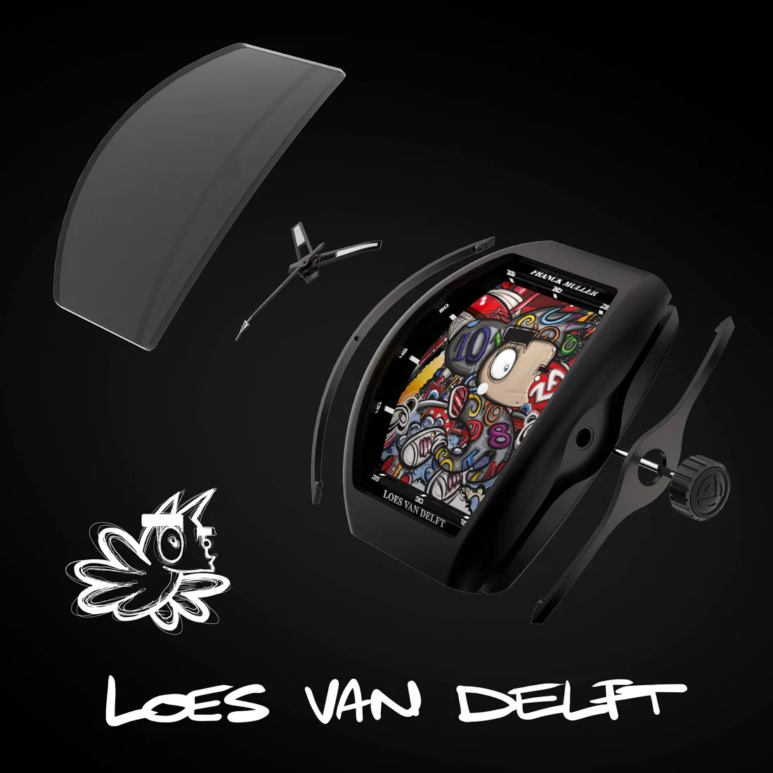
In Loes van Delft’s hands Franck Muller’s unruly curved barrel of a Vanguard case becomes a forty-three millimetre stage. Building that stage was the hardest technical problem of the collaboration, and the problem was not aesthetic but geometric.
The original print given to each collector measures ninety by ninety centimetres; the area of the dial given over to the picture is roughly three by four. The image shrinks about thirty-fold in each direction and nine hundred-fold in area: you are copying a wall mural onto a postage stamp, and every brushstroke must still be legible.
The real bottleneck is colour. Two adjacent tones on a ninety centimetre canvas read as two separate colours; brought down to three centimetres they blend optically into a third, muddy one. Each of the twenty-six colours therefore had to be chosen again so that it would keep separating at small scale, and by the watchmakers’ own account that is what consumed the most time.
You should not look for Grand Feu enamel here, and that is the correct choice of tool rather than a shortfall: holding twenty-six tones in register is a printing problem, not a kiln problem. The dial was printed with multi-layered, high-precision pad printing and silkscreen, then sealed under a hand-applied gloss lacquer. Each colour needs its own etched plate, its own silicone pad and its own pass, so twenty-six colours means twenty-six plates, and if one pass drifts by a few hundredths of a millimetre the outline and the colour inside it no longer sit on top of one another. The pad is silicone because it deforms under pressure and can lay ink onto a curved surface, which is required here since the Vanguard dial and crystal carry a curve in two axes inherited from the Cintrée Curvex. But a pad that flexes stretches the image, so the file is pre-distorted in the opposite direction, exactly as a world map is stretched flat to sit correctly on a globe.
One last refinement: the coloured numerals are Franck Muller’s own Color Dreams signature, and here they are embedded in the picture rather than laid on top of it. The 10 is inside the character’s ear, the 8 in his body, the 4 beside the red FM disc, and the minute scale has been pushed onto the flange to leave the centre empty. Inside runs the calibre MVT FM 2536-SC: automatic, a hundred and ninety-one components, twenty-five jewels, 28,800 vph, forty-two hours of reserve. Hours, minutes and central seconds only, because every complication demands space, and the space it demands is exactly where the eye goes first.
Three Acts: 50, 75 and 5
The first act opened in Amsterdam at the end of 2023: the Vanguard Color Dreams Loes van Delft, fifty pieces. Each comes with a ninety by ninety centimetre print signed by the artist, numbered to match the watch, so the owner of watch twenty-seven also owns painting twenty-seven.
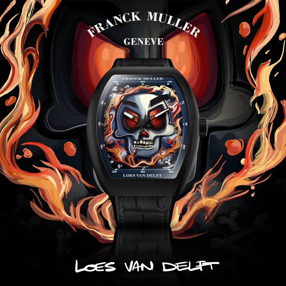
The second act opened on 30 October 2024 and the tone had changed: the Vanguard Loes van Delft Skull, seventy-five pieces, a skull staring out of flames with the same black bar across its red eyes. The artist uses it not as an image of death but of change and renewal. The chrome blue skull sculpture beside the watch at the launch had two round ears on top: the skull is not an abstract emblem, it is the character’s own skeleton.
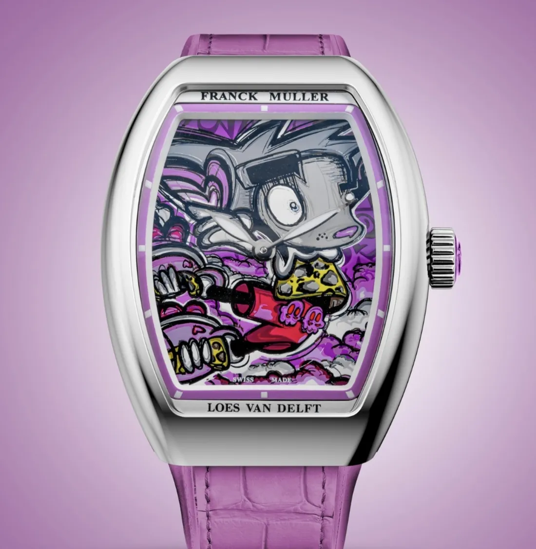
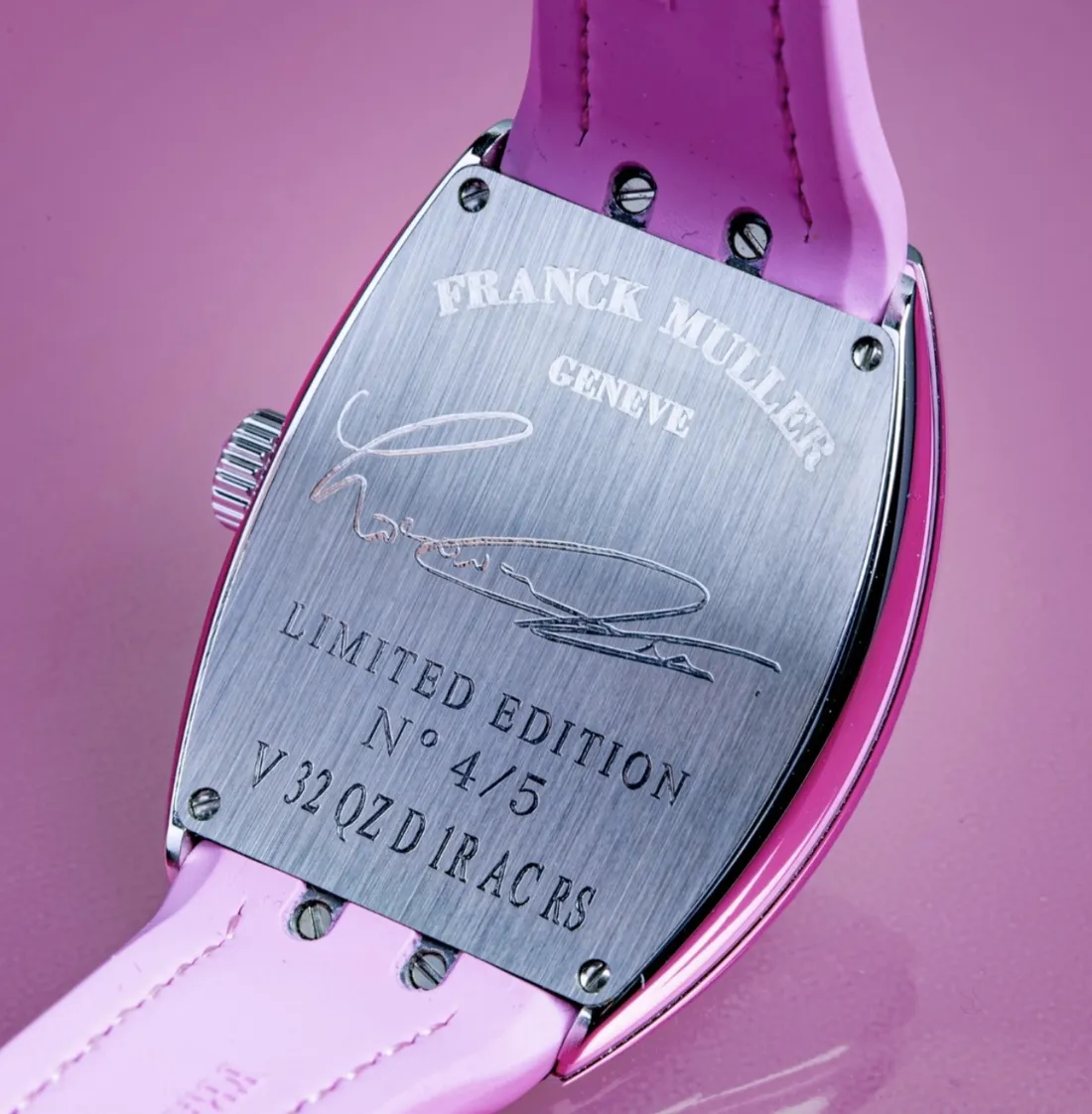
The third act opened this April in Geneva, at Franck Muller’s own WPHH salon, and the real news is not the colour but the number. On the back of this watch, beneath the artist’s engraved signature, stand two lines: LIMITED EDITION N° 4/5, and the reference V 32 QZ D 1R AC RS. Not fifty, not seventy-five: five pieces only, and the example here is the fourth of those five. Ten times rarer than the first model, fifteen times rarer than the Skull.
The reference reads like an identity card: V 32 is the thirty-two millimetre ladies’ case of the Vanguard line, QZ means quartz, AC steel and RS pink. The case is hand-polished steel, thirty-two by forty-two point three millimetres and nine point nine thick, with sapphire crystal and thirty metres of water resistance. Inside runs the quartz calibre MVT FM 1518-QZ: forty components, five jewels, a battery life of about five years.
There is a telling change on the dial too. At forty-three millimetres the Color Dreams numerals were buried inside the picture; at thirty-two there is no room for that. Once you have fitted a face into thirty-two millimetres nothing is left to bury numerals in. So the markers moved out of the picture onto the flange and were reduced to plain batons. As the picture shrank, the watch withdrew.
Laid side by side the run sizes trace a curve: fifty, seventy-five, and five. Warhol brought the soup can into art by multiplying it; across these three acts the same image walked in the opposite direction, until it was very nearly reduced to one.
With these limited editions Loes van Delft and Franck Muller are throwing a pink laugh at the rigid kingdom of time. That mischievous character on your wrist, smiling at the relentless race of the hands, reminds you of one thing only: time may be flowing away, but as long as you keep your spirit as free as a child in the street, those cold numerals can never rule you.
format_quote"The centre of a dial is the most expensive real estate in watchmaking. Giving it to something that does not measure is courage itself."
Hasan Bekmezci