Anybody who watches Formula One starts reading the colours at the edge of the screen without being taught. Yellow says a driver has come in under his own best. Green says he has beaten it. Purple is something else entirely: fastest of the whole field through that sector.
That colour system began as a design decision and turned into a language. Today, even with the sound off and every name unread, somebody looking at the colour on screen knows who has the race. Purple is shorthand for an advantage measured in thousandths of a second.
A watch brand moving that colour onto a dial is therefore not only an aesthetic decision. It is borrowing timing’s own code.
format_quote"Purple is shorthand for an advantage measured in thousandths of a second. Moving it onto a dial is not aesthetic but coded."
Alex Mourin
The second source of the colour is geographical. The model was prepared for the Singapore round of the season, and the shade is tied to the city’s national flower: an orchid hybrid that takes its name from the woman in whose garden it is said to have grown.
A country choosing a hybrid plant as its emblem is an interesting decision. A hybrid comes from two different lines meeting and is by definition not pure; most national emblems want the opposite, to anchor an origin in one place. For a city whose port and population arrived from many directions, that choice is a quiet sentence about itself.
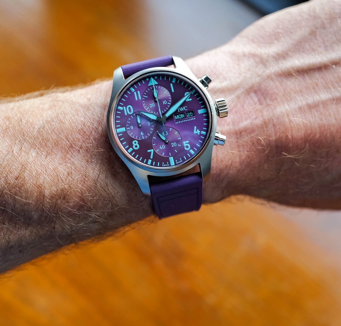
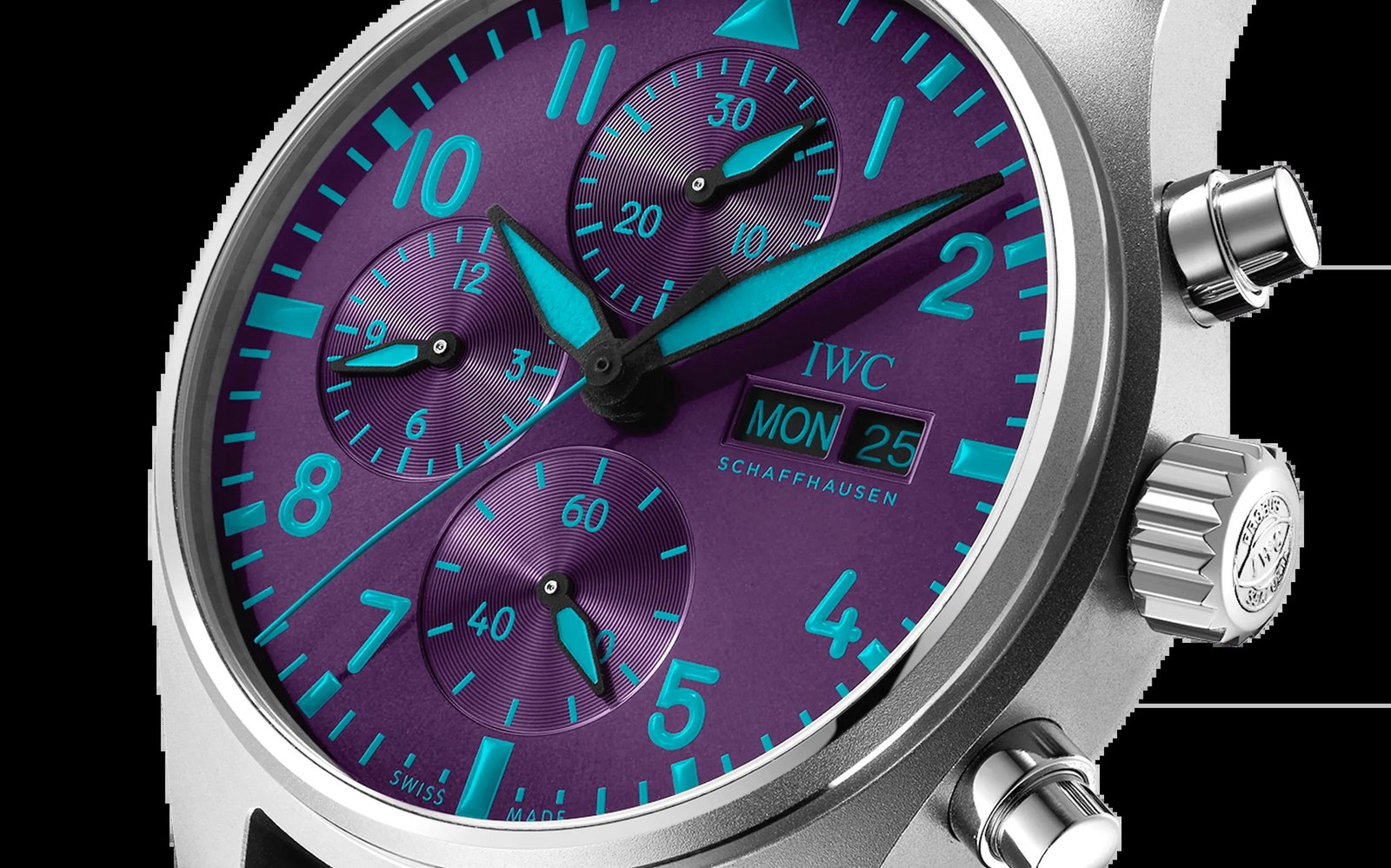
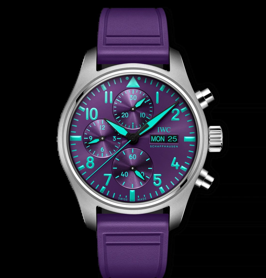
The purple of the dial comes from there and has been kept saturated. A saturated colour is risky on a chronograph dial, because counters and scales can vanish into it. IWC has solved that with turquoise as an accent. Turquoise sits opposite purple, and placed side by side the two separate each other rather than competing. That is why the main hands and markers stay readable.
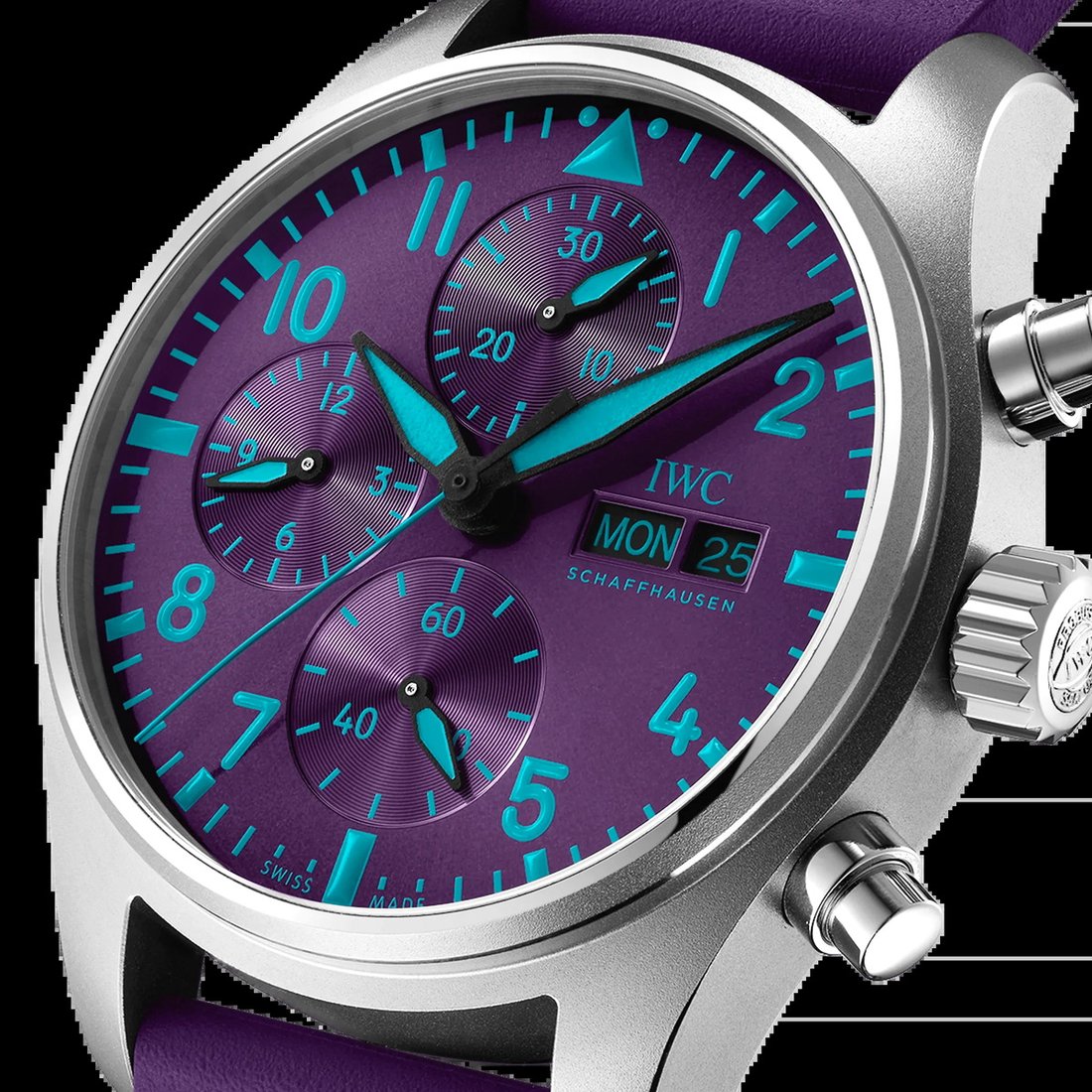
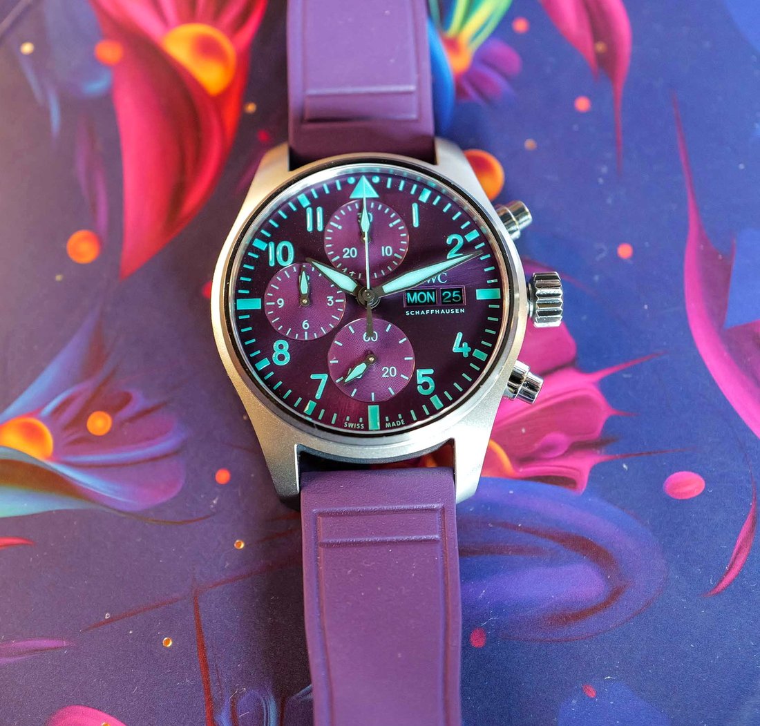
The case is forty-one millimetres and carries the pilot’s watch architecture IWC has used for a long time: a wide dial, thick markers, a softly drawn body. Day and date are given together at three o’clock. That arrangement is economical for legibility; collecting two pieces of information in one window opens no further hole in the dial.
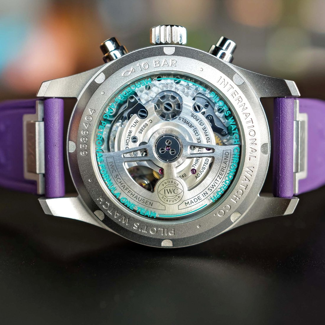
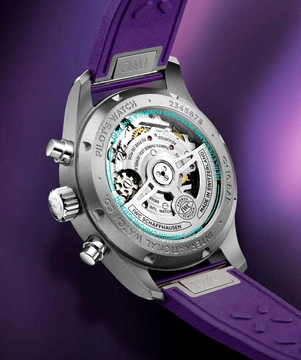
Inside runs calibre 69385, from IWC’s own chronograph family: self-winding, column-wheel, with forty-six hours of reserve. A column wheel is the toothed part that routes the chronograph commands and decides how the pusher feels. The other habit of this family is the vertical counter layout: the minute and hour counters sit stacked rather than side by side. The arrangement comes from a pocket watch tradition and has a practical side too, since two counters on the same vertical line are combined by the eye in a single glance.
Ten bar of water resistance and a sapphire back are two details expected on a team watch of this kind and not always given.
format_quote"Two counters on the same vertical line are combined by the eye in a single glance. The vertical layout is not a tradition but a convenience."
Alex Mourin
format_quote"Both are chasing an invisible margin, and both know that at the end of it the margin becomes visible."
Alex Mourin
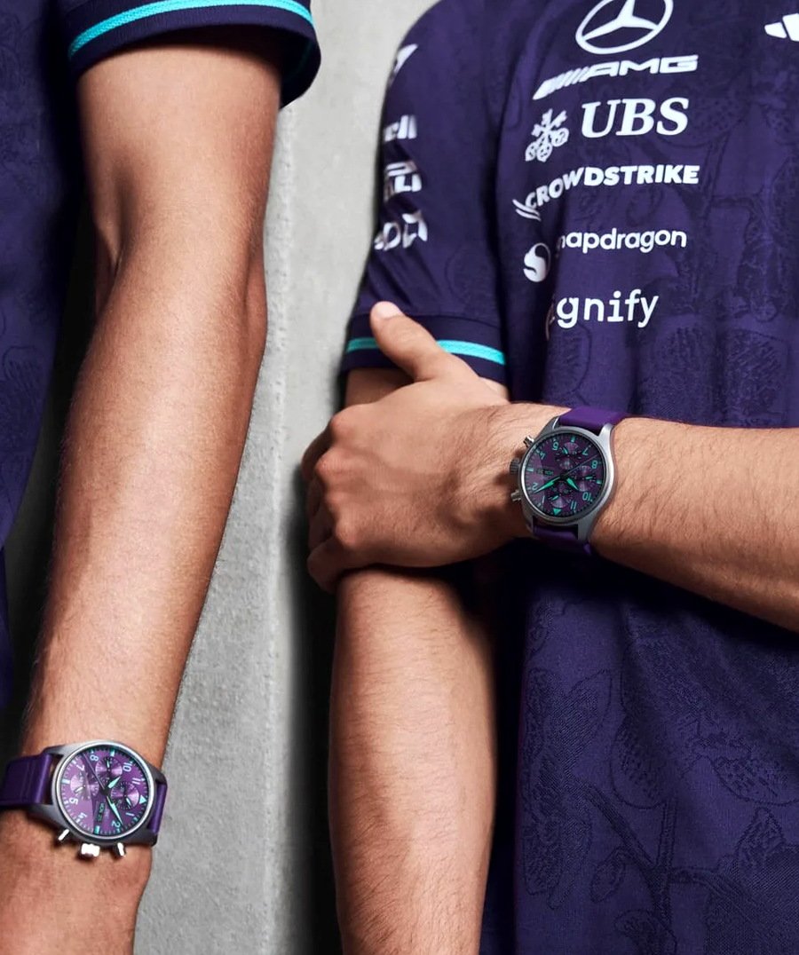
This is the fourth model IWC has made with the team. The title the brand uses in the partnership is engineering partner, which places the connection outside marketing and inside a shared obsession.
That obsession is this: a racing team and a watch manufacture are both trying to measure the same thing and win the same thing. For an engineer it is a thousandth of a second; for a watchmaker it is a second a day. Both are chasing an invisible margin, and both know that at the end of it the margin becomes visible.